Logo Rewind
Trademarks of Medieval Norwich

In Logo Rewind: Trademarks of Medieval Norwich, graphic designer and educator, Darren Leader, dusts off the forgotten merchants' marks of medieval Norwich, uncovering the city's rich history of brand design, and showcasing its historical and artistic significance.
Upon entering Norwich, visitors are greeted by its understated motto: a fine city. It goes about its business quietly, but is home to great art, innovative research and a rich history.
Exploring Norwich will uncover gems and Darren Leader has done exactly that. The visually stunning and historically insightful book, Logo Rewind, published by the UEA Publishing Project in collaboration with CreativeUEA, delivers a comprehensive and passionate exploration of over 200 of the traders' marks, dating back to the fourteenth century, of medieval Norwich. These merchants' marks were a visual language; an example of brand design in its infancy that informed the local population of the owner's trade and, much like the purpose of contemporary logos, hoped to convey a stamp of quality.
The marks and their meaning
Wander the streets of Norwich and you are bound to stumble across one of the marks; knowing of their existence simply brings them to the fore. For centuries they have remained hidden, overshadowed by the ever-expanding city around it. In Norwich, you'll generally find them within the old city walls. Film fans might happen to look up and spot one in Cinema City (see John Cambridge's) and visitors to Strangers' Hall may find themselves leaning on a wooden panel embossed with a mark. History came to life for Leader when he found one: "You begin to experience the city in a different way when you examine those kind of things. I went to Cinema City once and I turned around and there were a couple rendered in the stained glass. I was blown away!"
"You begin to experience the city in a different way when you examine those kind of things"
Tim Pestell, Senior Curator of Archaeology at Norwich Castle Museum and Art Gallery, and contributor to Logo Rewind, explains that "merchant’s marks were likely first adopted as indications of ownership so that a merchant could be sure of marking all their stock to ensure it could be easily tracked, especially if being shipped over long distances."
For passersby, it would be reasonable to assume that the marks are simply decorative carvings, but they had a much more practical purpose. Outside of the nobility, the clergy and the merchants, a large proportion of the population would have been illiterate so what better way to advertise one's trade than through carefully crafted images. The visual language of the merchants' marks inherently suggests that meaning was embedded in the designs. A common code within the marks is therefore likely. Leader explains that "there were trends of design. For instance, you see a lot of examples of the sign of four". Through the sign of the four, Leader believes that merchants were striving to convey quality: "here's one of the possible meanings of the sign of four: prudence, justice, courage and temperance. It's close to what we understand as brand values." Clearly, the logo designers of the medieval era share a common purpose with logo designers of now; through imagery they are presenting themselves and their product(s) as trustworthy and high quality. Pestell expands on this, stating that "as the nature of a mark giving a guarantee was so bound up with the individual trader, it was inevitable that such marks became a proxy for that person – just as heraldic arms did for the nobility."
Logo designers of the medieval era share a common purpose with logo designers of now; through imagery they are presenting themselves and their product(s) as trustworthy and high quality
The sign of four was such an established and recognisable seal of quality that the merchants would hide it in their work. "You'll begin to see triangular shapes within a design, but if you rotate it, it reveals a sign of four, which I think is really innovative practice," claims Leader. A star sign was another evident use of symbolism within the marks, and one which is commonly seen in brand logos today. "If you imagine you are transporting goods, [a star] is symbolic of guidance and protection," Leader explains, suggesting that the marks were not solely for the purpose of conveying brand quality.
One question remains tantalisingly unanswered: who created the marks? It seems obvious to claim it was the merchants themselves, but Leader has another theory. "It must have been a specialist. It's been remarked that lots of the merchants designed these logos and I reckon in some cases that's probably true, but you would have to know a great deal about the visual culture of that time." Perhaps an inability to conceive of medieval logo/graphic designers is indicative of twenty-first century arrogance.
Leader poses the idea that the specialists' skills could have historically been used for religious and superstitious purposes. He describes how Matthew Champion, in his book Medieval Graffiti: The Lost Voices of England's Churches (2015, Ebury Press), discovered patterns in medieval churches, and suggests that "if you were wary of misfortune, death, illness or the devil, these elaborate geometric patterns were meant to lure and trap the devil."

The mark of John Cambridge, Mayor, 1430 - inside Cinema City.
The mark of John Cambridge, Mayor, 1430 - inside Cinema City.

The mark of Nicolas Sotherton, with the guild of grocer’s coat of arms – inside Strangers’ Hall.
The mark of Nicolas Sotherton, with the guild of grocer’s coat of arms – inside Strangers’ Hall.

The mark of merchant, Ralf Segrym, St John Maddermarket, Norwich, 1439.
The mark of merchant, Ralf Segrym, St John Maddermarket, Norwich, 1439.

Mark of Ralf Segrym, Merchant, St John Maddermarket, Norwich, 1439
Mark of Ralf Segrym, Merchant, St John Maddermarket, Norwich, 1439
Rotated mark of Ralf Segrym, Merchant, St John Maddermarket, Norwich, 1439, to reveal the sign of four.
Rotated mark of Ralf Segrym, Merchant, St John Maddermarket, Norwich, 1439, to reveal the sign of four.
Rotated mark of Ralf Segrym, Merchant, St John Maddermarket, Norwich, 1439, to reveal the sign of four.
Rotated mark of Ralf Segrym, Merchant, St John Maddermarket, Norwich, 1439, to reveal the sign of four.
Mark of William Henuton, Merchant, Norwich, England, 1390. The inverted V sign is said to symbolise salvation descending from above.
Mark of William Henuton, Merchant, Norwich, England, 1390. The inverted V sign is said to symbolise salvation descending from above.
Medieval Norwich
The sheer volume of merchants' marks in Norwich is a reminder of the importance of the city in medieval England. "Medieval Norwich had grown from being an economic boom town of the eleventh century into one of the largest economic centres in medieval England, strategically positioned along the eastern seaboard", says Pestell. "This intensity of commerce, especially in the lucrative wool and cloth trades, made Norwich England’s ‘second city’ for much of the medieval period and led to the large-scale rebuilding of many of the city’s churches. The role of merchants was key to this as they reinvested their wealth in the community while also advertising their role."
Norwich's positioning was key to its success; close to the coast and with excellent access to rivers and waterways it came to be known as an 'inland port'. Ultimately, it was an international city of trade. This concept may seem incongruous to the widely held perception of the medieval era: "An incorrect assumption is that [trade in the medieval era] was a primitive form of business, when in fact it was highly organised. [Norwich-based merchants] were connected with this European network of traders called the Hanseatic League," says Leader. The merchants of Norwich were not merely supplying the local or even national population, their goods were transported overseas. "Norwich’s international trading links were founded on the long-distance exchange of goods which moved not only commodities over long distances, but ideas," Pestell claims. "Ownership marks used by merchants were therefore something seen not just in England but across Europe, and familiarity with international partners likely inspired each other’s designs."
"These marks principally tell us of the increasing self-confidence and pride of the mercantile classes in a city that was built on international trade"
Why is it that such an abundance of marks originated in this era? Pestell argues that the marks appear to signal Norwich's increasing trading power and growing wealth during the medieval period: "These marks principally tell us of the increasing self-confidence and pride of the mercantile classes in a city that was built on international trade. Although many individuals could attain wealth and status through their entrepreneurial efforts, they might still be seen as ‘new’ money in distinction to the older landowning classes who were more likely to draw attention to their ancestry through the traditional medium of heraldry. Merchant marks became adopted as a quasi-heraldic symbol allowing individuals to project their own self-image through use on objects like signet rings or seal matrices (the ‘stamper’ used to create a wax sealing to a document), in the stained glass windows of their houses and, in death, on the funeral brasses of their tombs. This is not a story of Norwich specifically, but it is one that Norwich is better placed to tell than most medieval towns and cities."
The author

Darren Leader, author and designer of Logo Rewind.
Darren Leader, author and designer of Logo Rewind.
Born in Ipswich and eventually arriving in Norwich, by way of London, Leader has lived locally for thirty years. Throughout that time he has worked as a graphic designer; though, he describes working as an educator as "the best job I ever had", perhaps providing an insight into his motivation to teach others about the under-studied, yet culturally significant, merchants' marks.
Leader's fondness for Norwich is infectious and researching Logo Rewind evidently strengthened his bond with the city. "It has been a wonderful thing to discover more about Norwich that I wasn't aware of. It really does deepen affection for a place that you live," he explains.
It is the duality of the city that intrigues and excites Leader the most; the coexistence and clear link between the old and new. Much like their medieval counterparts, "you've got this wonderful thing, all of these independent traders that work within Norwich that also understand branding," Leader suggests.
"I love the spirit of independence within the city."
Through the prism of Leader's designer's eye, Norwich is unique in its brand aesthetics. "I love the spirit of independence within the city. Norwich was really synonymous with creating that independent vibe of business, but also doing it well, communicating it well. When you look at the branding of Flint hairdressers in the city, as well as Strangers and many others, it's very cleanly and professionally done."
Leader's inspiration for the book came from an unlikely source: a blurry JPEG found on the internet. Whilst researching merchants' marks for another project, Leader stumbled upon an image which included twenty marks. Somewhat serendipitously, he discovered they were all from Norwich. "That blew my mind a bit because all of the logo devices that we had seen in the other project were from across Europe, and also print as a technology was quite late coming to England. There were only a few English or Scottish examples that we had so to find these twenty marks directly from Norwich was amazing!" Leader says.

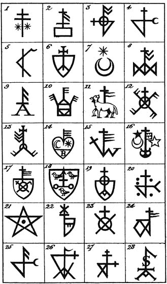
Leader stumbled upon this low resolution image online, igniting the Logo Rewind project. Credit: Selection of merchant's marks of medieval merchants of the City of Norwich, drawn by William Ewing, "Notices of the Norwich Merchant Marks," Norfolk Archaeology, Vol. 3, 1852. plate 1.
Leader stumbled upon this low resolution image online, igniting the Logo Rewind project. Credit: Selection of merchant's marks of medieval merchants of the City of Norwich, drawn by William Ewing, "Notices of the Norwich Merchant Marks," Norfolk Archaeology, Vol. 3, 1852. plate 1.
The collection Leader discovered, taken from William Ewing's 'Notices of the Norwich Merchant Marks' (Norfolk Archaeology, Vol. 3, 1852), was based on research conducted by John Kirkpatrick, an eighteenth century antiquarian. Leader describes how Kirkpatrick "had been compelled to go around the city and record these curious marks that were found in houses and in churches, and in contracts and deeds. He sketched them all." Leader's fascination with the old and new duality of Norwich is reflected in his work; much like Kirkpatrick three hundred years before, Leader has scoured the city for these marks and recreated them in his hand.

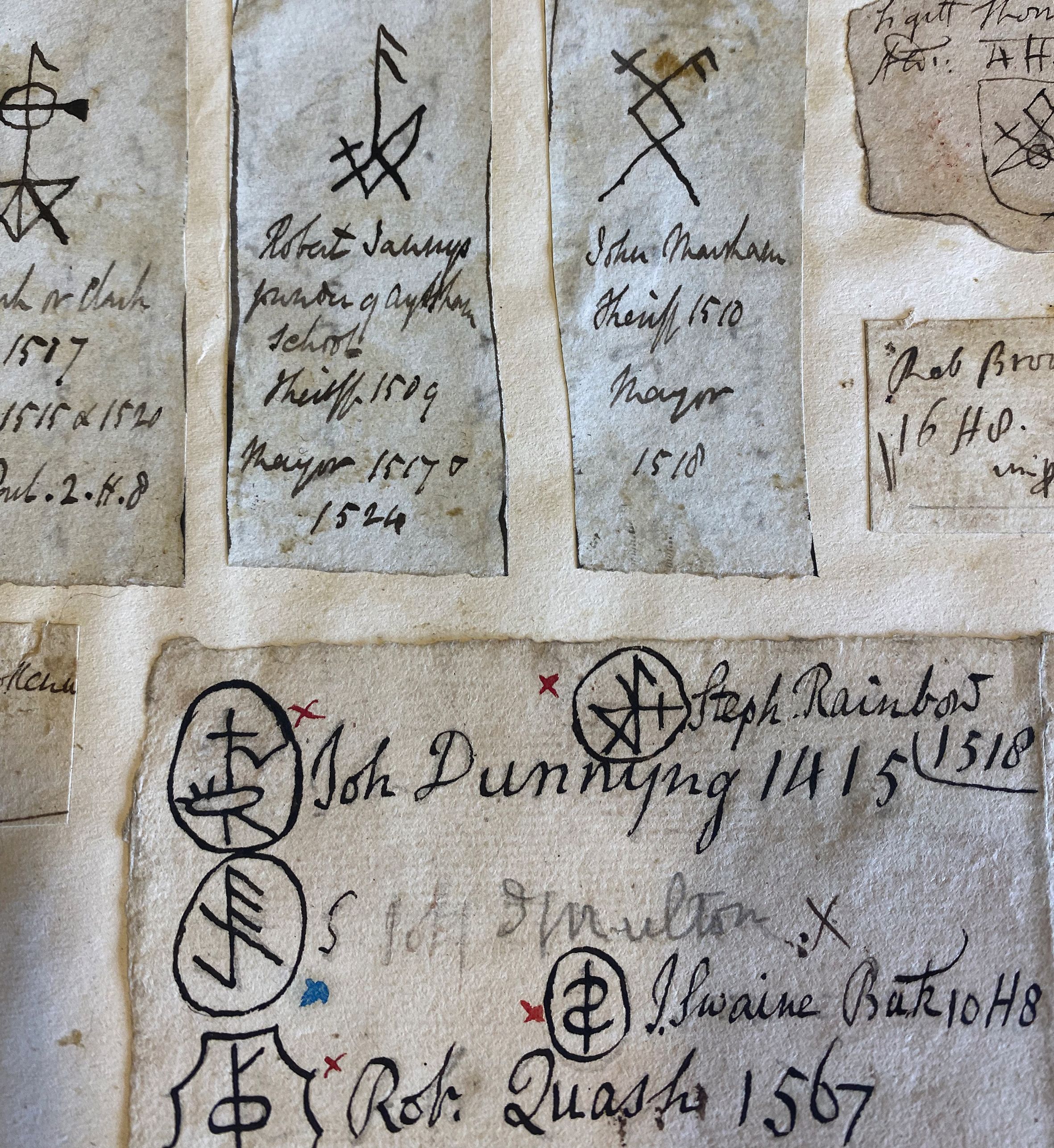
John Kirkpatrick's sketches of the merchants' marks he found in Norwich.
John Kirkpatrick's sketches of the merchants' marks he found in Norwich.
The creative process
Having explored the city, following in the footsteps of John Kirkpatrick, and scoured the history books, the task of reimagining the marks in a fashion that would be aesthetically pleasing to the modern eye remained for Leader. However, he appreciates the craft of the original designers too much to stray far from the centuries-old designs. "I was using modern day software like InDesign and Illustrator as any designer would if they were creating a logo, but I tried my best not to embellish them in any way. I followed their design as closely as possible."
"The visual language of angular lines and geometric shapes is reminiscent of much twenty-first century branding and logo design"
Leader has undoubtedly achieved his objective to adhere faithfully to the original designs, while managing to produce a book with a distinctly contemporary look. Describing the design, Alex Bratt, CreativeUEA Research Theme Executive Officer, says "The merchants’ marks are strikingly modern. The visual language of angular lines and geometric shapes is reminiscent of much twenty-first century branding and logo design, including the ‘less is more' aesthetic of the Bauhaus and this stripped back and simple approach to logos feels very relevant today."
Leader subtly nods to the history of Norwich in the design of the book itself: "I put [the marks] on a yellow background and suddenly they looked really vivid and contemporary, and it linked them to canary yellow." The canary was introduced to the area by 'The Strangers'; Dutch and Flemish migrants who revitalised the local wool and weaving industry, bringing their pet canaries with them.
In an industry such as design, where current fashion and stylistic choices are paramount, it is unusual to focus and take inspiration from such ancient sources; however, Leader hopes the book may inspire his colleagues to look back rather than forward. "My profession is obsessed with the twentieth century. We love Bauhaus, we love Dutch graphic design and modernism," says Leader. "I genuinely feel [medieval logo design] is overlooked as a piece of history. There is an opportunity to see designers discuss this and absorb it into their own work."

The Logo Rewind cover, illustrating Leader's use of the canary yellow background.
The Logo Rewind cover, illustrating Leader's use of the canary yellow background.
Collaboration
Such a comprehensive undertaking requires close collaboration with subject experts and project visionaries. Bratt describes how the "enthusiasm of the contributors, including Minnie Moll, CEO of the Design Council, renowned design historian Jens Müller, Dr Tim Pestell, Senior Curator of Archaeology, Norwich Castle Museum and Art Gallery, and academics from UEA and Norwich University of the Arts has been invaluable". He says it was "a pleasure" to work with Darren, and "it’s been wonderful watching [him] put together what is a really visually arresting book".
Logo Rewind does not mark the first of Leader's collaborations with UEA academics. "He previously worked with Dr Sophie Butler and Dr Tom Roebuck from UEA’s School of Literature, Drama and Creative Writing on the Unlocking the Archive project, a brilliant initiative to enable libraries and heritage organisations to make centuries-old books accessible to new audiences," says Bratt. "Logo Rewind, takes a similar approach, arguing for the continued relevance of something that could be seen as arcane and drawing new links between the past and the present."
Logo Rewind is available to purchase from UEA Publishing Project.
CreativeUEA is an interdisciplinary research theme at the University of East Anglia which builds on a longstanding history of creativity and innovation.